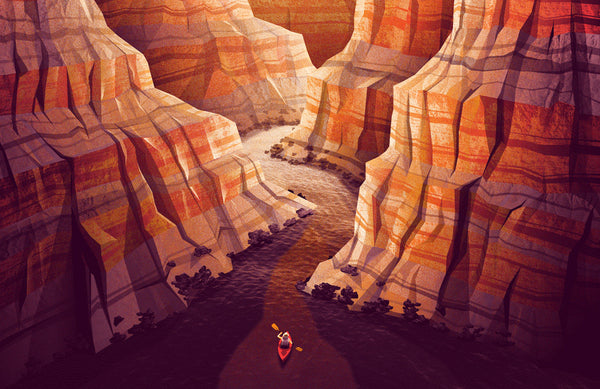
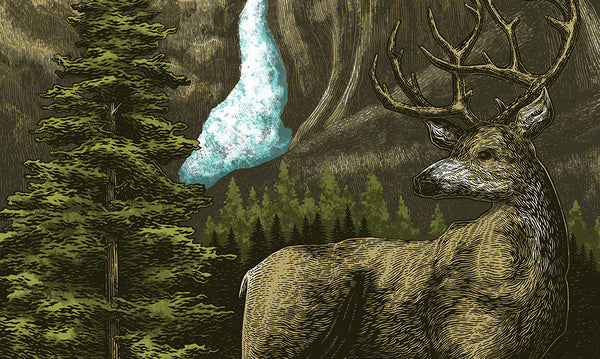
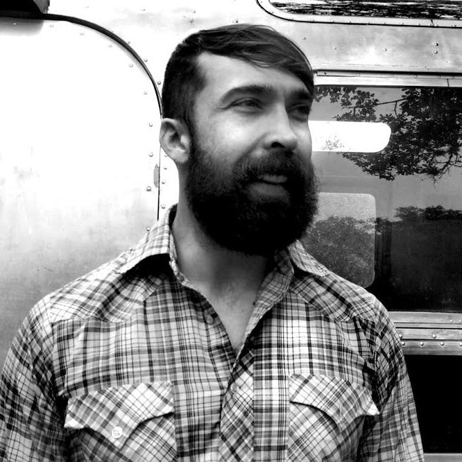
Let's just get this out there: Curtis Jinkins is a solid human. He also happens to be a freelance designer who owns and operates Neighborhood Studio. He got his start at the famed Planet Propaganda in Madison, WI but eventually moved back home to his native Texas. Curtis now lives with his wife and two boys in the Hill Country outside of Austin. He's known for killer branding, strong typography, and having fun with his work. The conversation about branding 59PS came up over lunch with Curtis a few months back. Even though we swear we weren't trying to drop any subtle hints, he immediately threw his hat in the ring. Working with Curtis has been a joy. Thoughtful but casual, fun but not off the rails. We recently had a chance to ask Curtis about his process and his take on things like branding and the parks.
What's your origin story when it comes to design and branding?
I've always been into creating things - drawing, painting, airbrush, woodworking, pottery. I was President of the Art Club in High School and my undergrad degree is in Fine Art. After graduating and quickly realizing the benefits of gainful employment, I went back to grad school to study Graphic Design. The same principles apply - form, shape, color, but it’s obviously more tied to concept and typography.
What were some of your sources of inspiration for the 59 Parks branding?
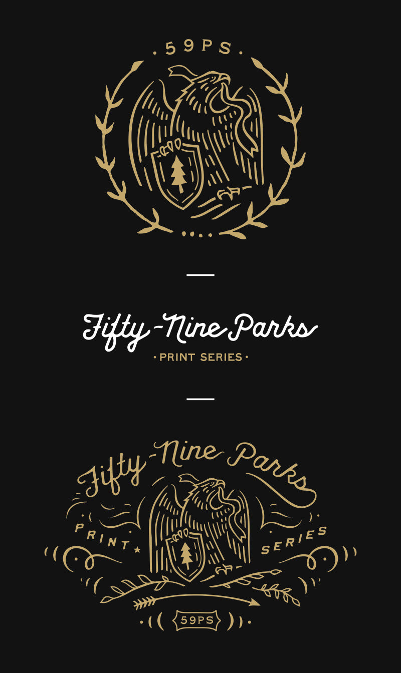
It’s really just vintage Americana. Obviously the old WPA National Parks posters were a big influence but I didn’t want it to be so nostalgic, a little more contemporary. I wanted it to feel official, something that maybe a government agency would’ve contracted out and turns into a commemorative gold coin.
It’s a daunting challenge to make anything that is printed on the work of so many great artists. I tried to create something that could be stamped small into the corner of each print, nothing too distracting. The goal was to compliment the artwork and add a subtle hint of authority or organizational oversight.
Did you hand draw some of the type? Can you share a little about your process?
Yes, this was all sketched out first and then digitized in both Photoshop and Illustrator. The typography is predominantly scanned from books or hand drawn, there may be a few typefaces that I roughed up.
Which National Park do you dig the most? Why?
Probably Sequoia? My wife and I took our boys there last year, the first time for all of us. Such a surreal environment, living in Central Texas there’s nothing that really compares. It was awesome watching them soak up that experience, they were actually quiet for a little while.
What's one piece of advice you typically offer to designers who favor branding?
I would say that it helps to be eclectic in your execution but I think that may just be advice I should give myself. I see designers that do the exact same thing for every client and I really don’t see how that can be enjoyable. It’s such a formulaic way to create artwork, if I weren’t constantly searching for new ways to execute concepts I think I would rather deliver packages for UPS. I love seeing designers and artists that take risks and find new and unique ways to communicate.
What other projects does 2016 have in store? What are you most stoked on?
I’m working on another deck of cards currently, that’s a trip. I haven’t had any interest in doing that again until recently. It’s a completely different process, really small and tedious. I don’t have the patience for that type of work very often.
***
Keep up with Curtis via his website, instagram, and twitter