Riley Cran is a designer based in the Pacific Northwest whose specialty is identity, packaging, and illustration. He's also a heavy-hitter in the type design department. When we approached Riley about making a poster for the series he instantly had visions of a killer typeface that could be utilized within the series. This was perfect since we were working on the template for the series at that very same time! Riley was a blast to work with. He's a true professional, a considerate human, and someone who's truly dedicated to their craft. We can't recommend working with him enough! In addition to creating the beautiful typeface for the series Riley also made some time to talk shop for the blog.
How do you typically prepare for a project like this?
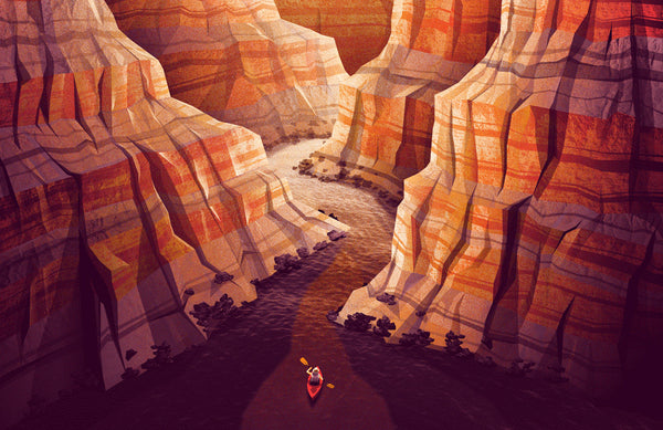
I generally prepare by thinking of the context the type will be used in, the designers using the typeface, and the end viewer. All of these things have some impact on the design of the type itself. Every type design project is influenced by history to some extent. In this case there was a lot of aesthetic influence from some illustrious historical sources, so research was key. The National Parks have a rich history of poster art, and there are a lot of typographical aesthetics associated with them.
Funny enough, the design legacy (of the Parks) is actually vastly important to me, which is perhaps a somewhat atypical way to enjoy the parks.
Tell us about your process when it comes to research?
I knew the project would have to balance historical influence with a more neutral contemporary tone, so I began by thinking about the graphic design associated historically with the parks, and researching poster designs from the Works Progress Administration. There were literally thousands of poster designs made for the WPA in the first half of the 20th century, and many of them advertised national parks to the public. At that point in time it was largely about reminding the public of the beauty of the parks during the depression, or during war-time. So there’s a real power to the images, in a graphic design history context, and I wanted to examine the role that typography played in those. What I found was that many of the posters featured lettering (as opposed to type), much of which was quirky and a little too characterful to serve as inspiration for a more neutral-looking typeface (as this one aimed to be). But there were many sans-serif lettering examples in the posters that were drawn to resemble (and expand upon) the vernacular type styles of the era, and the country. And that was a quality that I chose to focus on - the idea of what ‘American Letters’ might look like.

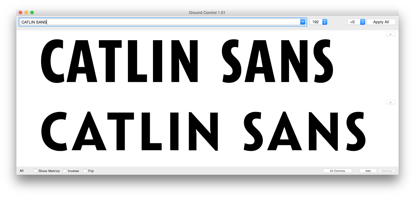
It seems as though you've pulled inspiration from American typefaces of the 30's-40's. What other sources played a role in your inspiration for Catlin Sans?
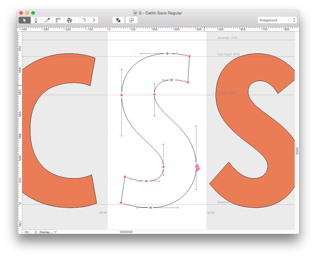
While chasing the ‘American Letters’ idea, it was natural to pull some inspiration from the ATF Gothic typefaces (Franklin Gothic, Alternate Gothic, etc). In a general way, that inspiration (and the lettering from the posters) made me realize that all-caps condensed sans-serif typesetting seemed to be one of the most quintessential ‘American’ typography traditions. That’s why Catlin Sans ultimately took the form it did: An all-caps display face.
I also turned to the vernacular of the American sign painting tradition. Sign painter alphabets (as they are sometimes documented in specimen books and trade manuals, or seen in-use on actual signs; wonderful letterforms pulled from the memory of the practitioners) seem to have a tendency both to distill the ‘soul’ of many popular typefaces of their respective eras, but also to introduce a human quality that many sans-serif typefaces seem to avoid in favor of a rigid system of geometry. Whether it be the influence of the actual brush itself, or the simple ability to depart from traditional typesetting, sign painting references often represent the lively and characterful side of the sans-serif genre, in my mind. It was fun thinking of how a sign painter would interpret popular typefaces of American history, as it probably is a somewhat similar process to designing Catlin sans, digitally.
 What was the main objective you hoped to achieve with this typeface?
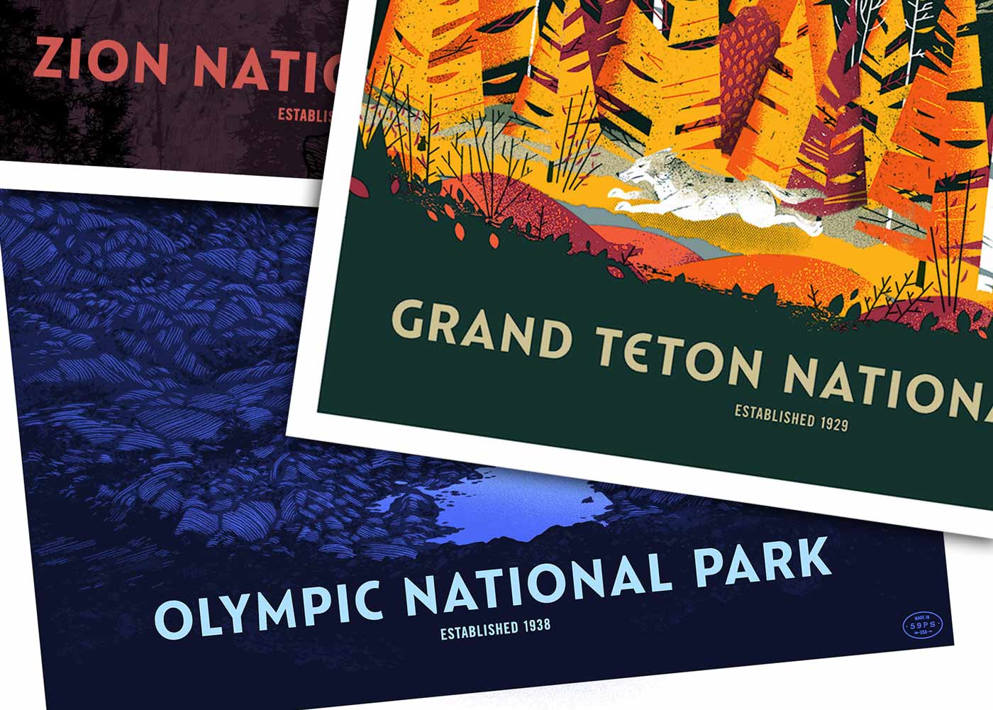
Although I’d only seen a few brief art samples when I began the project, it was clear that the overall goal and execution of this poster series was to show a contemporary vision of nostalgia. So that seemed to describe the typeface brief pretty clearly; to take these historical references and make them sing in a contemporary way that didn’t distract from the poster art itself. To represent each park name with the right balance of character and neutrality. To be historically respectful, without being stale or forced.
Every now and then I stopped to think of how truly difficult it was to make something that captured this feeling. Probably because sans-serif typefaces are such a ubiquitous part of our landscape now, and we don’t stop to appreciate the meanings they carry. I hope this one succeeds in conveying the ideas that inspired it.
Where did the name Catlin Sans come from? Can you tell us about any significance there?
During my research about the parks I discovered that the actual concept of the parks was (albeit somewhat abstractly) described originally by a painter named George Catlin, 2-3 decades before the first parks were actually founded.
He once wrote: “(…)by some great protecting policy of government... in a magnificent park... a nation’s park, containing man and beast, in all the wild[ness] and freshness of their nature’s beauty!”
After learning this, it seemed only fitting that a poster series celebrating that idea would carry his name.

We know where you stand with type design but why are the National Parks important to you?
Funny enough, the design legacy is actually vastly important to me, which is perhaps a somewhat atypical way to enjoy the parks. The very poster designs that were referenced in the making of Catlin Sans have been some of my all-time favorite pieces of design in general for years. So it was a wonderful project to take on, in that regard.
Personally I remember a few road trips through Redwood National Park that left me pretty stunned by its scale. Endless enormous trees that enveloped the sunlight and wound in a never ending path. I won’t forget that any time soon.
What one piece of advice do you have for up-and-coming type designers?
Wow, that’s a big question! Do you mean people who are succeeding with their type design projects, getting traction? In that case: keep doing what you are doing, the world could use more like you! If you mean people who are beginning to draw letters and working on typefaces, I’d say: Start thinking about the relationship between counterforms/spacing/positive + negative space in your typefaces as soon as you can. When my thinking shifted to viewing letterforms as both black *and* white shapes (which type designers like Cyrus Highsmith regularly champion), it sent me on a whole new path of learning.
What's next for you? Any exciting project queued up for 2016?
I have some custom typeface commissions I’m working on currently for clients, as well as some retail releases that will be available this year via Lost Type. My next release is an upright script typeface that I’ve been working on, on and off, since 2014. I’ve been sharing some progress on my instagram page.
Thanks for having me!
***
Keep up with Riley via his website, instagram, and twitter